What makes some websites user-friendly and others not so much?
Sometimes it's hard to say, but you know that website A is better than website B for some reason, even if they look similar.
It can be more
- straightforward navigation
- fewer distractors
- more appealing color schemes
- the language it speaks
All those factors, among others, contribute to the quality of website or web app user experience.
The quality of website experience is one of the most critical factors contributing to the success of a website. It makes people return, and even recommend. If poor, visitors never return.
As website owners, we know we must not underestimate the importance of a great website experience. So, we read tons of guides and work hard on website design. We want the website to look good, work well on all devices, and be organized logically.
But we tend to make one mistake - don't confront our ideas with the outside world. The problem is we know too much about our websites - how they are organized, and what we expect visitors to do there.
For us, things are obvious. After days spent working on websites, we can use them blindfolded. We can easily overlook problems that visitors will quickly notice and that will have a negative impact on user experience.
Luckily, there are ways to determine how visitors assess your website's experience: One of them is running a website experience survey:
What Is a Website User Experience Survey?
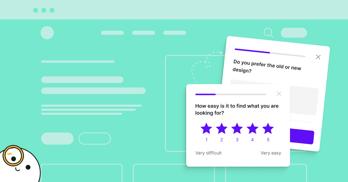
A website user experience survey is a way of collecting feedback from website visitors to learn how they assess the experience of visiting your website. Website experience surveys are often conducted using website surveys. A small survey widget appears on the website asking for feedback (example below).
Website User Experience Survey Questions
The first step to running a website user experience survey is choosing the right questions. It might seem obvious, but it is tricky - sometimes, changing the wording in questions can dramatically change survey response rates and answers.
The questions we present here work well for Survicate users and for us:
"On a scale 0-10 how do you rate your experience?"
Answers to these questions will give you an overview of how people assess their experience with your website. It's the first step to a more in-depth website experience survey. The answers to these questions are not actionable, though. To make them so, ask follow-up questions.
Tip:
Target people who browsed a substantial number of pages (depending on your website, for some, it can be 5 while for others 10) and are about to exit the website. They had an opportunity to familiarize themselves with your website and are likely to know what's good or bad. If you want to find out why people bounce right after entering the website or shortly after, use a simple exit survey:
"What problems did you encounter while using the website?"
Find out why people give low grades. You might find out that some links or buttons don't work, the website loads slowly, or there's another reason. However, don't forget about people who give you high scores.
Tip:
Ask this question as a second step of the survey after asking to choose a grade. Show it to people who answered between 1 and 7. Use skip logic to do it.
"What did you like best?"
The answers to this one will reveal your most significant strengths. You should capitalize on them and not change them if you plan to redesign.
Tip:
Ask this question to participants who answered between 8 and 10 in the first question.
"What should we do to improve your experience?"
Don't guess what visitors want. Just ask them. This question will provide you with the most interesting insights.
There's one caveat here: Since this question requires some effort from visitors, response rates are usually lower compared to those of less demanding questions, like the previous ones. You're likely to see that over 20% of participants don't finish this step.
Tip:
Don't forget to set a thank you message after the last question.
This simple process we've just described helps you find out how people assess your website, what frustrates them most, what they like best, and what ideas for improvements they have.
But many more elements contribute to the overall experience, and if you want to discover how to improve the website, you should dig deeper.
One of the most critical factors contributing to website experience is navigation ('Don't make me think'). This element is worth taking a closer look at, especially when you run an e-commerce or news website with hundreds of pages. Organizing it well is a big challenge.
Take a look at this article to learn how to run a good website navigation survey. When you start the first satisfaction survey, relax and wait for data.
💡 YOU MAY ALSO BE INTERESTED IN: ‘What stops you from signing up?’ survey template

How to Analyze Website User Experience Survey Data
A word cloud will be helpful to analyze answers to the last open-ended question. It will show you which words are the most common with answers. But it's just an overview, and you should look at single answers, especially to questions asking about problems users face.
You should analyze survey results. Going through only 30-100 responses is often enough to spot the most serious issues. Not so hard, right?
There's just one small catch: website experience surveys are slightly different from other surveys since the experience can vary greatly depending on the technology visitors use.
Browsers and devices are the most important variables. It's usually Interner Explorer that causes most of the problems. But there's a lot of other browser-specific issues.
Here's our real-life example: After updating the design of our website, some of the buttons didn't work on certain versions of the Firefox browser only. Luckily, we spotted it quickly. But if unnoticed, this issue would have cost us plenty of signups and opportunities lost. Firefox is the second most popular browser used by visitors to our website.
How to spot similar issues while analyzing the survey results?
Filter answers based on browsers. You might notice that most of the solutions suggesting a particular problem come from visitors using the same browser. It may turn out that people using a different browser rate their experience well.
Make sure to fix elements that survey participants complain about. And, test your whole website on this browser as there are likely other bugs as well.
Running mobile website user experience surveys
Researching mobile website user experience is not much different from a desktop version. You can use the same set of questions and tips presented in the next section to apply to mobile experience surveys.
The one big difference concerns targeting - you can't use exit intent targeting because it's simply impossible. There is no way to detect when a person leaves your website, so no survey is triggered.
For this reason, we recommended running a specific survey targeted at mobile devices. Set the survey to appear when a person browses more pages than average.
When you analyze mobile survey results, filter answers based on devices or browsers - just like you did with desktop results. It'll help you to spot flaws that exist only in certain circumstances.
Website User Experience Survey Tips
What's the fastest way to ruin website experience?
A sure way to lay an egg is running a website experience survey against best practices.
A mistake would be to use intercept surveys. They disturb visitors, and for some people seeing such a survey is enough a reason to leave the website.
How to create a survey that doesn't harm website experience and gives reliable results?
- Make sure the design of survey widgets is appealing. That said, widgets must be visible. No one will answer a survey if they can't see it because it matches the design of a website so closely.
- Use targeting to adjust the message to the context.
An example: Don't ask "How would you rate your overall experience?" right after a person enters your website. Trigger this question when a person is about to leave the website after browsing at least a few pages.
- Run separate surveys for desktop and mobile devices to adjust targeting.
- Use sampling if you have thousands of visitors a day. This may sound strange, but it's better to have 100 text answers to analyze than 100 thousand. (Unless you have a whole team dedicated only to analyzing the data.)
If there's just one person responsible for the website, he or she won't be able to process all the data and will look at just a chunk of it. It's better to collect and analyze 100 answers than to collect 10k responses and analyze none.
💡 YOU MAY ALSO BE INTERESTED IN: Web app user experience survey template

Summary
Now you know everything you need to start running website experience surveys. What you should do next:
- Choose the right website survey tool
- Set up a survey using the template provided above
- Analyze results keeping in mind described catches, especially browsers and devices
- Implement changes on the website based on analysis
- Create a new survey to see how changes improved the website experience
That's it - you don't need anything else. Just let me stress the importance of the 4th point of this framework:
You collect and analyze data to improve the experience, and it's impossible without implementing changes on the website and running tests.

.webp)


.svg)
.svg)
.svg)

.svg)


.svg)


.svg)


.svg)


.svg)


.svg)

.svg)
.svg)

.svg)


.svg)


.jpg)
.svg)

.svg)


