What do you think of when you hear the phrase "great website design"? Depending on the resource assignment, you, probably, think about its homepage, maybe of its blog, its product pages, animated effects, usability, etc.
We bet you don't think about a 'Contact Us' page of your future website.
Unfortunately, very often contact pages get to the bottom of the priority list in terms of both copywriting and layout for many designers. Can you remember how many contact pages you've come across looked outdated even if the rest of the website was polished and up-to-date?
That is a huge mistake that can cost a site owner a considerable drop in conversion rates. In fact, a 'Contact Us' page is one of the top four most important pages on any website because it is typically one of the most visited site pages for most companies.
What Makes a Great Contact Us Page?
You know, the question of the best ‘Contact Us’ page is very subjective. We mean that what is awesome for you, may appear bad or even ugly for other people.
It's better to take into account not your personal taste and preferences, but User Experience. Please remember that a good ‘Contact Us’ page should have the following things.
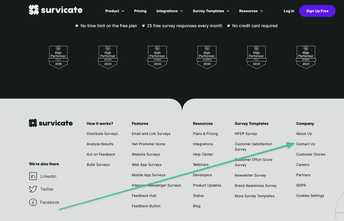
It must be easily accessible from the home page. You should put the link to your "Contact Us" page on a prominent (expected) place on the website so that the users could easily find it.
For instance, we have it included in our footer on every single page so that our website visitors can easily find it and get in touch with our team easily. And that's a part of good customer experience.
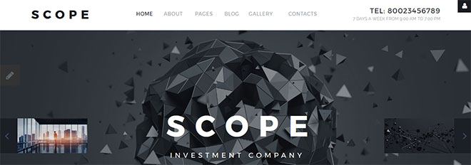
It goes without saying that your "Contact Us" page should be clean and the design should reflect your brand’s visual identity, etc.
Actually, there are plenty of ways to give your customers the possibility to get in touch with you.
But it is very important to remember that nowadays your customers expect more than ever before from their virtual experience. There are so many other resources out there that know how to involve them. That’s why the way you communicate with the users is so important. You need to constantly evolve and meet their highest expectations by being available anywhere, anytime.

As a rule, the best contact pages perform certain functions:
- They explain why a visitor should contact you and describe how you can help to solve your visitors' problems.
- They include an email and phone number so that the visitors could quickly find the required information.
- They include a short form that uses fill that will help you understand who's contacting you.
- They include a call-to-action to keep people on your website and provide them with another option if they don’t want to complete even a simple form.
- They showcase the main company ideas. This can be done by including a list of recent blog posts or articles about the company in the press.
- They are linked to your active corporate social media accounts like Twitter, Facebook, Instagram, and LinkedIn to give visitors a way to engage with your business.
- They redirect the user to a thank-you page that explains when and how you'll contact them.
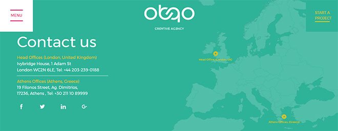
Companies that have advanced, thought out marketing strategies apply a great approach known as opening communication channels that meet new standards expected by the customers. It is the Omni-channel communication approach. With modern technologies you are able to communicate with customers through chat, messaging, text, voice, Messenger, Whatsapp, Line, Viber, and whatnot.
This is not only convenient to the customers but can also positively affect your conversion rates. Such kind of communication channels variety is priceless for any business owner. Never underestimate the value of having all communication channels available in one place. Convenience is the key for customers, and a happy customer turns into the loyal one.
Professional digital marketers who have been developing landing pages for big clients like Societe Generale Banks, Ferrari, Bentley, and many others and have been working with contact forms for many years share the following tips that have been worked out from their experience, failures, and success.
Experts say that creating an efficient contact form is both simple and complex at the same time:
A good contact form should include 1 or 2 fields. The phone number and perhaps a name. That's it.
It also needs a unique call-to-action. Here is a specific article on this theme.
The conversion greatly depends on call-to-action or CTA how marketing pros call it. Have you ever noticed that most of the small business websites don’t contain a CTA at all, while it can boost your conversion, by motivating people to contact you and doesn’t let them go to your competitors?
If you are a smart merchant, you might have experimented or experimenting with different CTAs, trying to maximize conversion from website visitors who filled the contact form or received a call. Many entrepreneurs find a solution to the callback option. "Get a callback in 25 seconds" button is able to increase your conversion up to 50%. You can try the Callmaker.net or any other similar service.
What is a Callmaker? It is a widget that offers a callback within 25 seconds. It really works, it converts website visitors into calls and sales.We will explain how this service works on the Callmaker example. Supposing your visitor has questions, they click the “ get a call back in 25 seconds ” button and fill in their phone number. Then Callmaker automatically finds an available sales rep within 25 seconds and calls back the client. The call is absolutely free for the clients no matter what country they live in.
You should take “ contact form ” on your website as the backbone of the lead generation. You can grow your business by opting for it.
Many businesses can't reach success today because they are not designing contact forms correctly or not using them.If you need to decide how many form fields you should include, confirm where in the marketing funnel your offer is being placed:
If it's at the top of the funnel, you can create as many leads as possible. That means not many form fields are needed for creation. You can nurture them to a sale through email afterward.
If it's in the middle of the funnel, you need to explain to your visitor why your product or service is the best option to solve their problem. Typical content is not only limited to webinars, case studies, free samples, etc.
It's at the bottom of the funnel - this is the purchasing stage. Here, the prospective buyers know what they want, have evaluated all options, and are ready to buy. These contact forms are longer because businesses want as much qualifying information as possible to close the sale.Now, when you have developed the strategy, you need to decide which form field should be mark required and which field should be optional.
An average online marketing website usually uses three mandatory and two optional fields
- Name is a mandatory field
- Email is a mandatory field
- Phone is a mandatory field
- City is an optional field
- State is an optional field
But as you understand ‘city’ and ‘state’ fields would also be mandatory for product delivery.
The fact is that there is no perfect formula for the number of form fields or how many fields should be mandatory and optional. It all depends on you and your clients need Just always follow the strategy that will help you to grow your business when you choose the fields and their number.
Are you ready to get inspired?
Below, we've featured 5 examples of some of the best 'Contact Us' pages out there.
Check them out and think about how you can incorporate some of these ideas into your own contact page design.Examples of the best 'Contact Us' pages
'Contact Us' Page Examples
Below you can see some of our favorite 'Contact Us' pages that correspond to best practices. Have a look and get inspired for your own web development.
By the way? Have you recently created an inspiring 'Contact Us' page? Get in touch with us and we will be happy to feature you on the list.
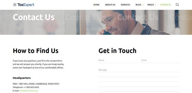
Tax Advisor & Financial Consultant Website Template
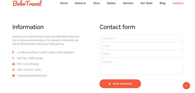
Travel Premium Moto CMS 3 Template
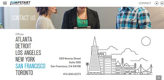
Jumpstart
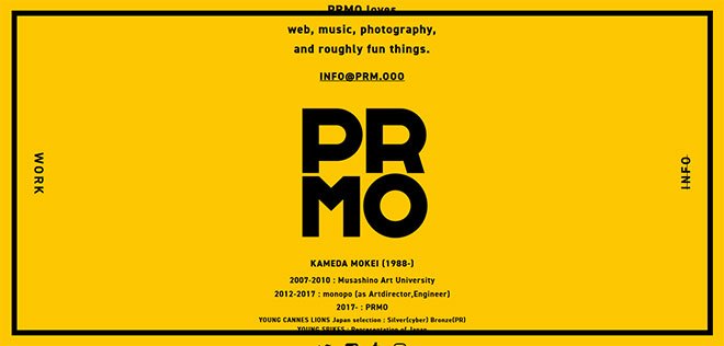
PRMO
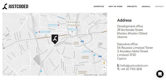
Just Coded
Collect customer insights with Survicate
So there you have it, the list of tips on how to create some of the best 'Contact Us' pages out there. Take a look at your business' contact page and see how it stacks up or if there are any tweaks you can make to give your site visitors a better, easier, and more enjoyable experience.
Getting customer feedback on your current page won't hurt, either. To launch a survey, simply sign up for your Survicate account and see how much feedback you can gather with our 10-day free trial!

.webp)


.svg)
.svg)
.svg)

.svg)


.svg)


.svg)


.svg)


.svg)


.svg)

.svg)
.svg)

.svg)


.svg)


.jpg)
.svg)

.svg)
